Modernizing the MyDMV Platform for 27M+ Drivers
I unified 15+ disconnected DMV services into a single platform used by millions of California drivers; the work was expressed through a cohesive dashboard experience and the definition of shared patterns for identity, lifecycle status, and task completion, modernizing the underlying design system for scale and long-term evolution.
Project Details
My Role:
Lead Product Designer
Team:
UX Research, Project Manager, Engineering (Frontend & Backend), Senior Directors
Timeline:
24 months (Phase I: 16 months design + development, Phase II: feature extenstion)
The Core Challenge
MyDMV was designed around single, linear transactions, when in reality users were actually managing portfolios of assets—IDs, licenses, and multiple vehicles—each with its own status, urgency, and next action. Without shared patterns for asset collections or lifecycle state, users struggled to understand what was complete, what was pending, and what required attention.
This gap surfaced as fragmentation across California’s DMV digital ecosystem. Services were spread across 15+ disconnected applications with inconsistent status models, duplicated data, and fragmented task flows, creating failure states and eroding trust in the platform.
Business Impact
High call center volume, long in-office wait times, and incomplete online transactions meant only 23% of users completed tasks digitally—leaving millions of transactions in more expensive channels and creating preventable operational burden.
System Constraints
MyDMV had to live within the existing DMV design system.
That system was originally built to support an informational website. It did not yet support transactional flows or managing multiple assets with shared lifecycle states, status, and actions.
As MyDMV evolved into a product where users managed portfolios of vehicles and credentials, this gap became a structural limitation. The design system lacked the shared foundations needed to support multiple asset types and services in a consistent way.

Using User Stories to Identify System Patterns
Working in partnership with research and project management, we aligned design priorities around user frequency, business impact, and technical feasibility. Rather than treating these as isolated features, this process surfaced recurring platform-level patterns that informed where the system required shared rules, states, and foundational components before any individual UI decisions were made.
Mapping Garage Entry Flows & Validation States
Given the size and scope of MyDMV, we couldn’t design every surface at once. We intentionally started with the Add Vehicle flow because it represented the most complex entry point into the platform. Unlike IDs or driver licenses, where users typically manage a single asset, vehicles introduce multiple assets per user, each with different states, timelines, and actions. That variability made this flow the best place to establish durable system rules.
Defining these behaviors at the point of entry ensured that only valid assets entered the system, and that state, status, and messaging remained consistent as MyDMV scaled across assets and services.
Add / Remove Vehicle — Entry Flow into the Garage Card system
Pre-submission validation states that prevent invalid Garage Card creation
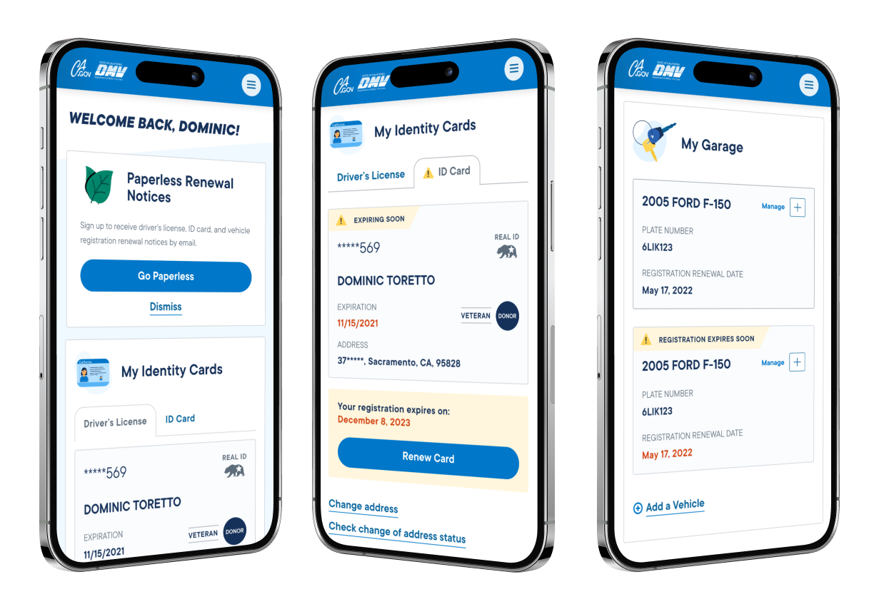
My Garage: A Scalable Asset Status System
We designed a persistent dashboard surface called the Garage Card that lives within My Garage and represents a single registered asset. Each card surfaces the asset’s current status, urgency, and available actions, giving users a consistent place to scan what is complete, what needs attention, and where to return after completing tasks.
Garage Components
To support scale and long-term flexibility, assets in My Garage are assembled from a consistent set of composable components rather than monolithic components. Each asset instance follows the same structural and behavioral rules, with lifecycle state driving presentation and available actions.
This composite approach allows individual elements, such as registration identity, status banners, CTA surfaces, and contextual actions, to be reused across Garage surfaces while preserving consistent meaning and interaction patterns.
System Decision:
Where should asset status logic live?
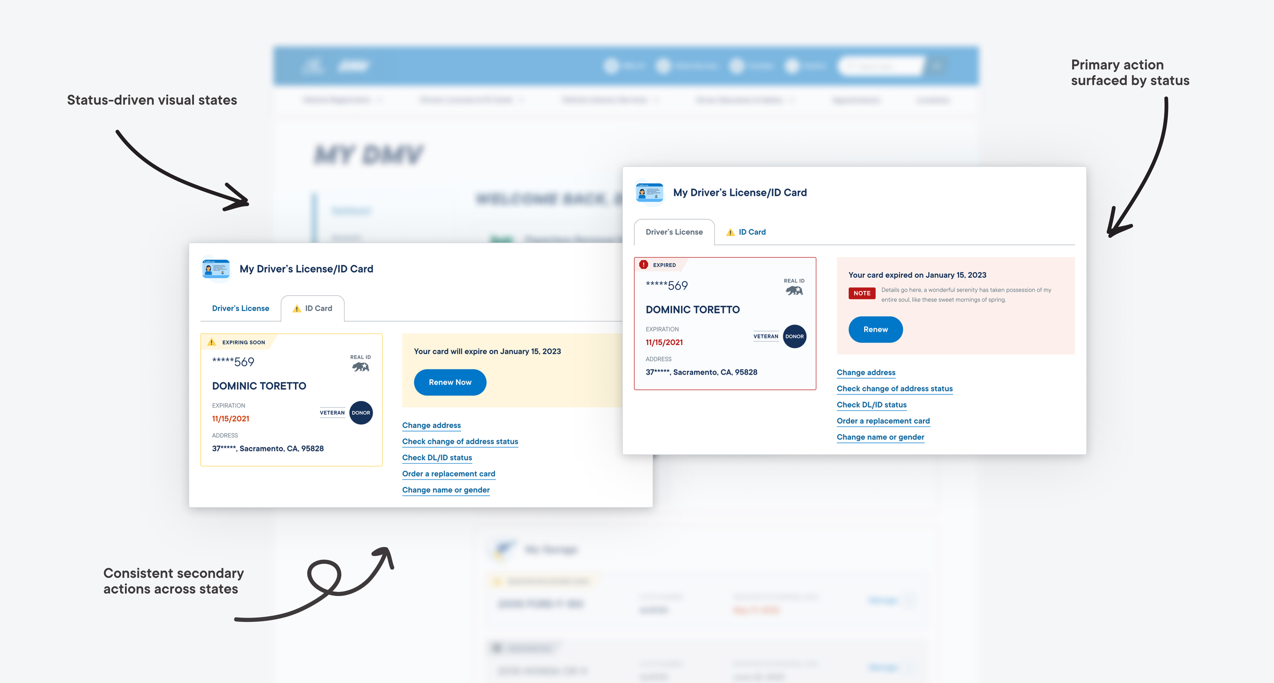
Status logic extended beyond the Garage Card, so I defined a shared status model that could be applied across asset types. Alert copy and visual treatments were encoded as tokens, allowing the same states to scale consistently across components while remaining easy to extend over time.
Registration identity component. A single component using a status collection to control states.
Tokenized State Structure
State styling is token-driven, not component-specific.
Shared tokens control color, emphasis, and messaging, ensuring lifecycle states retain consistent meaning as the system scales across components and asset types and reduces component bloat.
By separating state logic from individual components, new Garage surfaces and asset types can adopt existing lifecycle states without introducing bespoke variants.
Shared Status & Action Rules
While the Garage Card was the first surface where a pattern emerged, the underlying logic was designed to scale across asset types.
The same status model powers Driver’s License and ID cards, using shared rules to determine visual treatment, messaging, and available actions based on an asset’s lifecycle state.
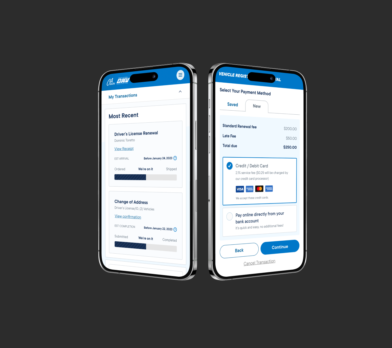
The Dashboard: Surfacing Key Tasks
The dashboard consolidates driver’s license details, vehicles, and notices into a single, actionable view. Status indicators and one-tap actions surface what needs attention, allowing users to act immediately without navigating legacy menus or disconnected tools.
As a shared system surface, the dashboard established consistent patterns for status, actions, and escalation across licenses, vehicles, and alerts, enabling new services to plug into the same card structures and state rules as MyDMV evolved.
Result: Reduced order-status support calls by over 30%.
Design Decision:
How many tasks should the dashboard show at once?
Research showed users averaged 3–7 active tasks, but surfacing all of them increased cognitive load. We prioritized decision clarity at scale using system-defined urgency and progressive disclosure, keeping the dashboard stable as policies and user states evolved without renegotiating layout or hierarchy.
This work reduced anxiety in high-stakes moments.
DMV interactions are often stressful, time-sensitive, and high-stakes. My goal was to design an experience that felt steady and reassuring, helping users move through critical tasks with confidence rather than uncertainty.
High-Craft Design for High-Friction Systems
DMV interactions demand confidence but rarely inspire it. I focused on high-craft execution—clear hierarchy, intentional use of color, and illustrations for warmth and personality—to reduce friction and bring calm to otherwise stressful tasks.
With 27 million Californians relying on this platform, the project reinforced how design decisions ripple at scale. Building rules for alerts, prioritization, and truncation taught me the value of reducing noise while keeping users informed. The experience strengthened my belief that thoughtful systems design can both simplify government services and improve public trust.
Reflection
+42%
Digital adoption increased from 23% to 42% in the first 6 months for license/vehicle renewals
-30%
Support call volume decreased by over 30% for order status inquiries ("Where's my license/registration?"
27M+
The platform now serves 27M+ eligible California drivers with a unified experience