
Elevating storytelling across a global brand platform
Starbucks needed a scalable editorial system that could unify storytelling across global markets while giving teams the tools to publish with clarity and confidence. I led the design strategy and system architecture to create a flexible platform that serves both evergreen brand stories and seasonal campaigns.
Project Details
My Role:
Principal Product Designer
Team:
UX researcher, junior designer, product manager, Engineering (Frontend & Backend), Brand stakeholder, and global editorial team
Team:
Multi-year engagement with ongoing deisgn system evolution
The Core Challenge
Starbucks' editorial platform was facing mounting complexity as the brand expanded globally. Editors struggled with inconsistent layouts, cumbersome workflows, and limited scalability, making it difficult to maintain brand voice while serving diverse market needs.
Inconsistent layouts: Editorial stories lacked rhythm and visual hierarchy, making long-form content difficult to navigate.
Cumbersome workflows: Editors had to manually piece together layouts, slowing down publishing and creating bottlenecks.
Limited scalability: The system couldn't flex across global markets or adapt to seasonal campaigns without significant redesign effort.
Business Impact
Editorial teams spent excessive time on layout assembly rather than content creation. The lack of systematic approaches to storytelling meant inconsistent brand expression across markets, with seasonal campaigns requiring custom development rather than leveraging reusable patterns.
Discovery Workshops
Audience & Goals
We kicked off with an immersive discovery phase that aligned business, editorial, and design stakeholders. The goal was to define the right balance between brand control and content flexibility, ensuring the system could serve everything from campaign launches to community storytelling.
Facilitated cross-team interviews to understand limitations and aspirations
Mapped priorities across brand and editorial teams
Established shared goals for storytelling and system governance
UX Foundations
Alongside creative exploration, we established the UX patterns that would guide how stories are structured and discovered.
Clarifying Story Entry Points
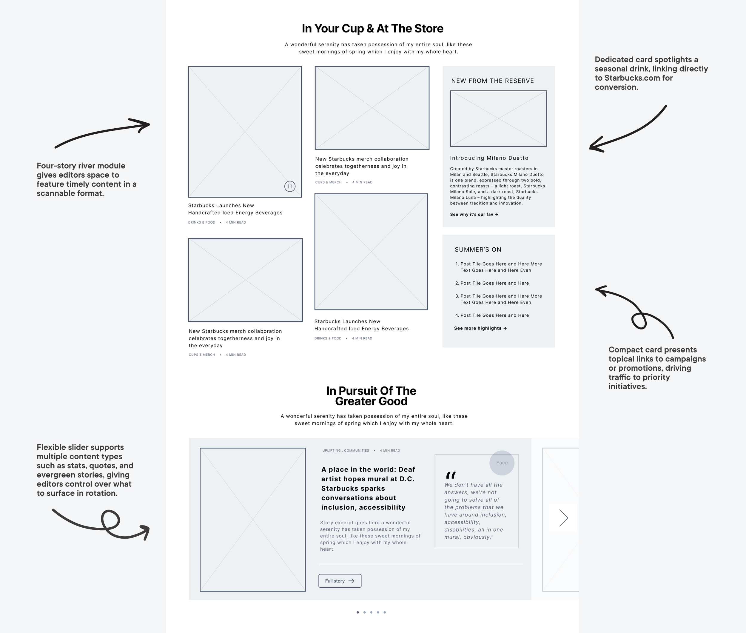
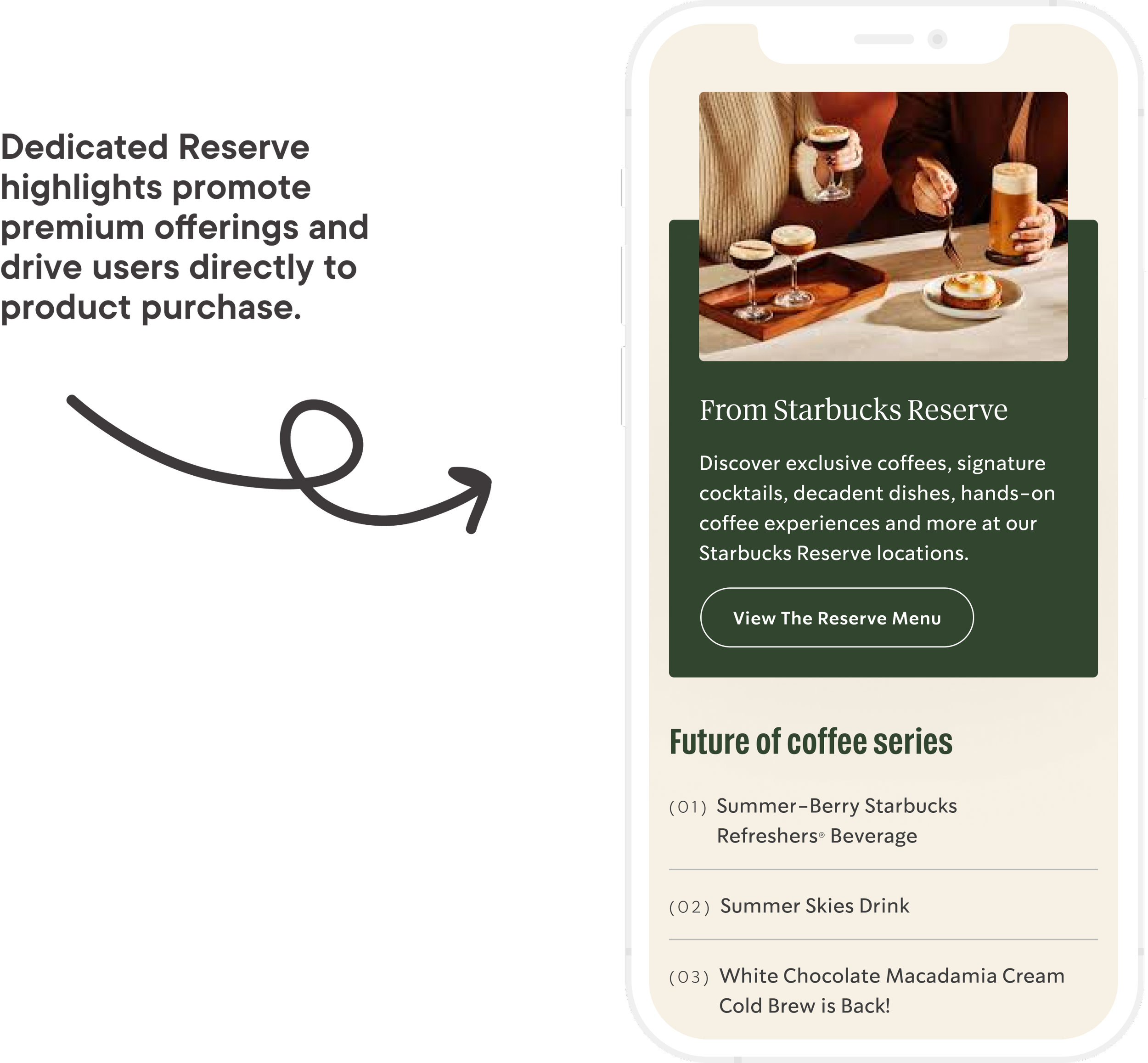
I introduced topical rivers with supporting highlight cards to guide readers into timely content while ensuring evergreen brand stories never got buried. This structure reduced editorial overhead and gave Starbucks a repeatable way to balance business priorities with audience interest.
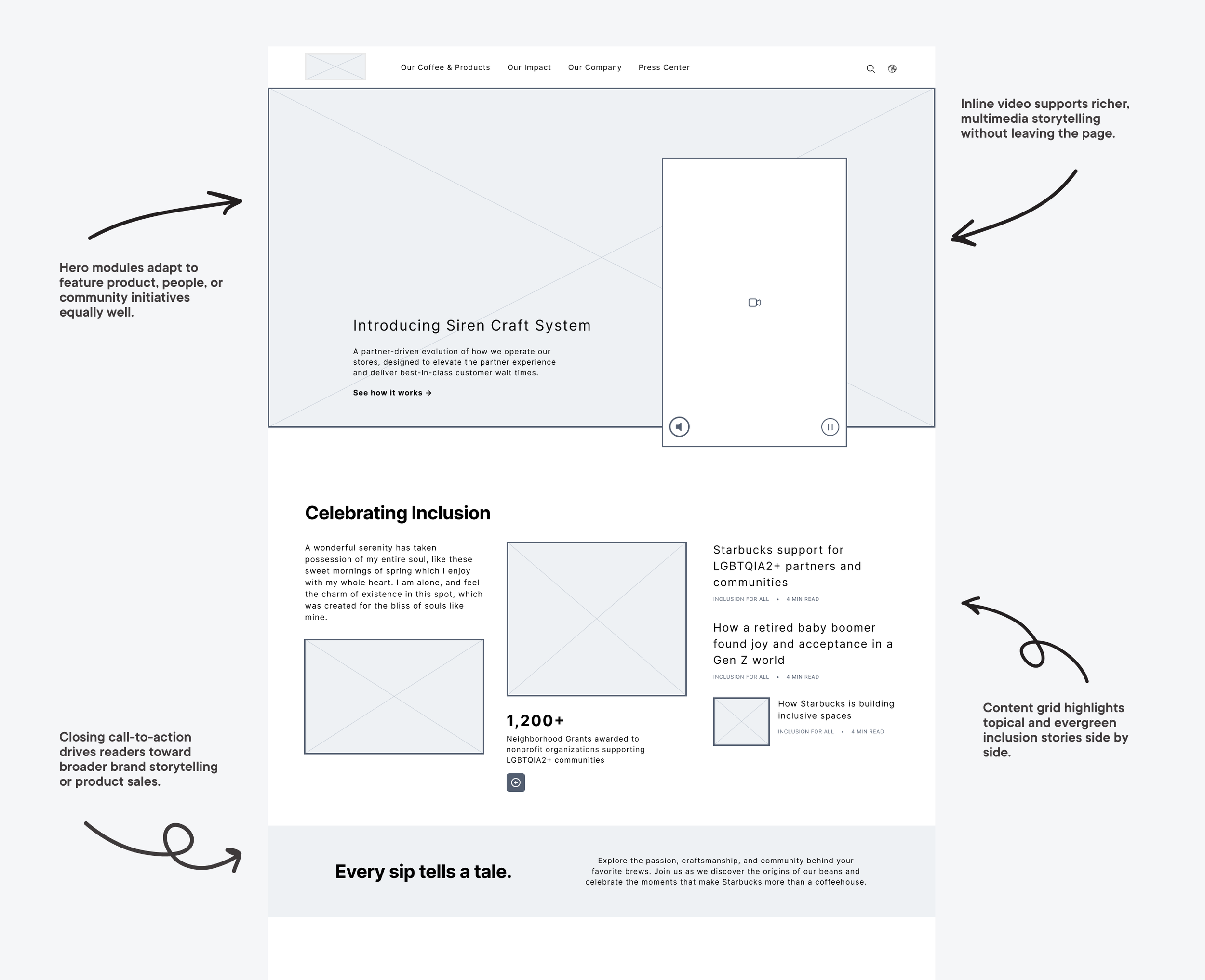
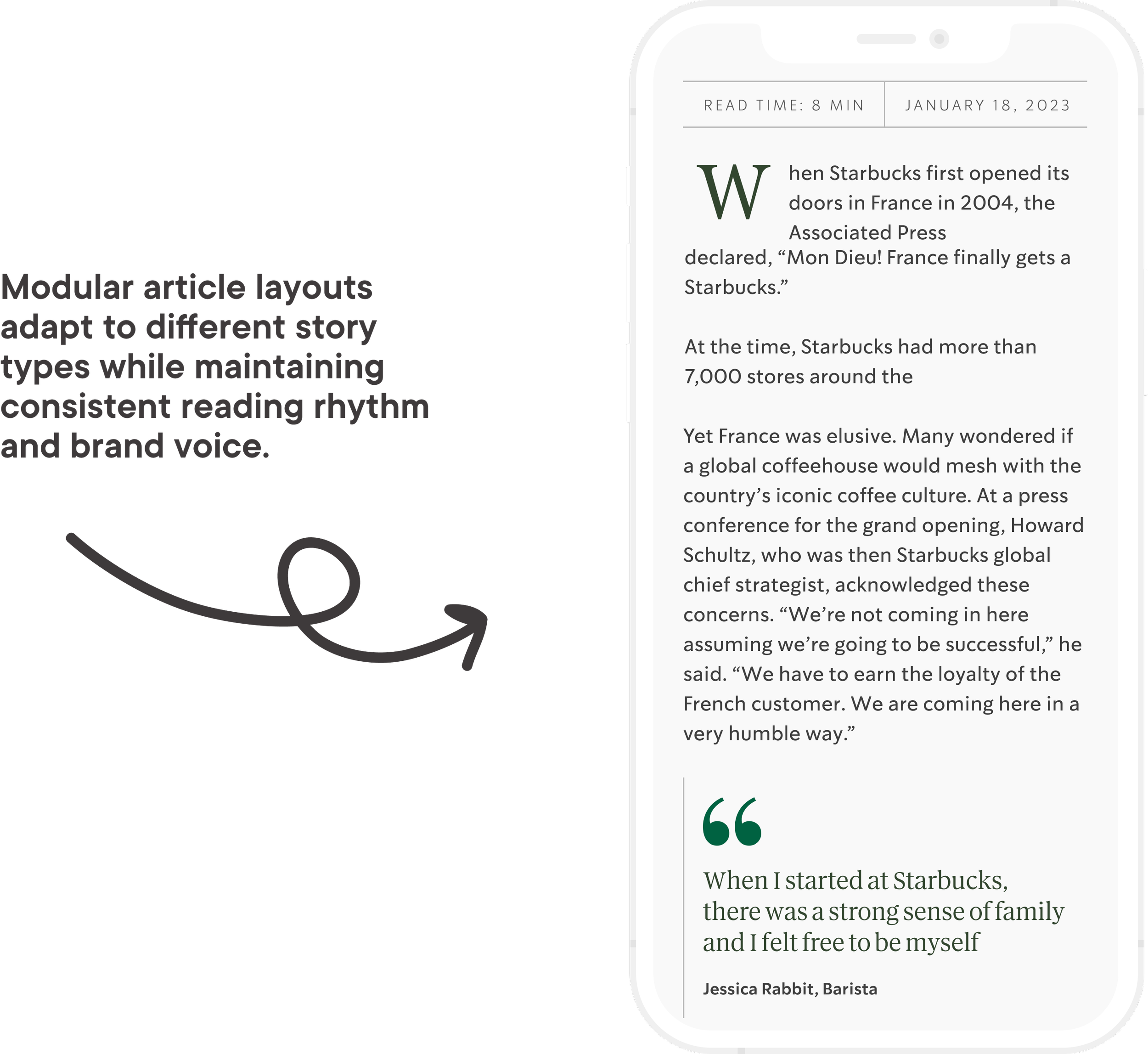
Creating Consistency Across Modules
By defining a shared set of components, quotes, stats, video, and multi-column layouts, we eliminated the ad-hoc patterns that had been slowing down publishing. Editors gained speed and confidence, while users experienced more consistent, scannable stories.
Scaling for Longevity
Spotlight sliders and modular grids gave Starbucks the flexibility to rotate seasonal campaigns or evergreen stories without redesigning pages each time. This adaptability meant content could stay fresh for users while saving design and development resources over the long term.

Design Decision:
How do we surface timely content without burying evergreen stories?
Editorial teams needed to spotlight seasonal campaigns, but Starbucks' core brand stories (sustainability, community impact) couldn't get lost. We introduced a hybrid river system where topical content gets priority placement, while evergreen stories remain accessible through persistent navigation. This balance served both business priorities and long-term brand building.
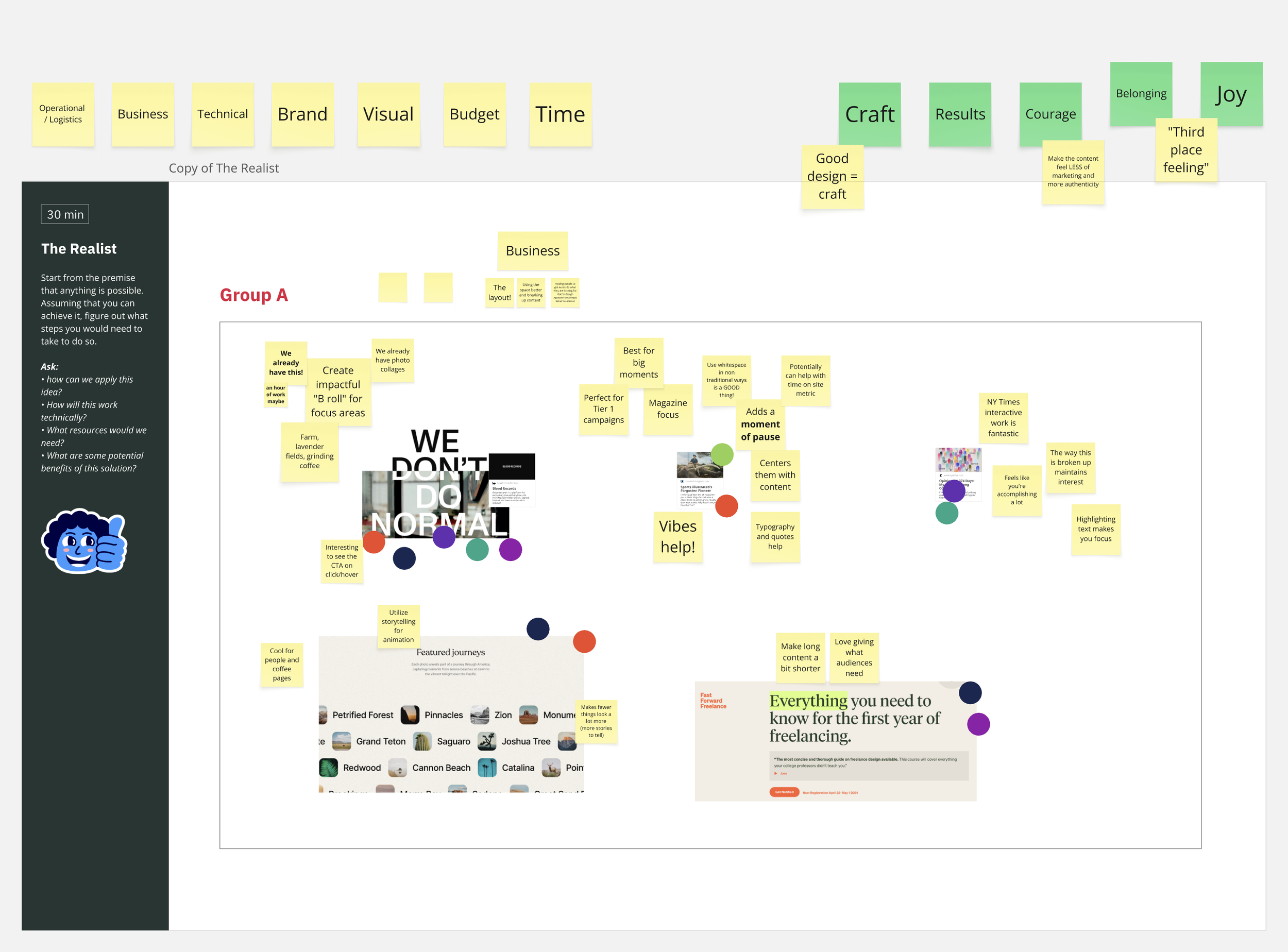
Fueling Creativity Workshop
To align creatively, I hosted a Fueling Creativity Workshop using the Disney Creativity Method, helping us explore bold ideas while staying grounded in feasibility and scale. We paired this with a Design Spectrum Workshop to map stakeholder alignment on brand expression—establishing a shared language and creative direction from the start.
Facilitated two visual workshops to align stakeholders around storytelling potential and brand expression
Used divergent and convergent thinking to explore motion, editorial layout, and component-level flexibility
Flagged early risks around accessibility, performance, and long-term maintainability
Balanced imaginative storytelling with scalable implementation across breakpoints and content types

Style Tiles
Coming out of our creative workshops, we translated insights into three distinct style tiles—each a motion-rich, system-oriented direction. These weren't just visual themes, but opinionated, testable concepts packed with theming logic, motion strategy, and component-level exploration. These helped clarify appetite for animation, seasonal variation, and scalable design patterns.
Created three distinct style tiles exploring motion, layout rhythm, and typographic hierarchy
Defined a visual strategy for modular storytelling, seasonal theming, and scalable components
Tested appetite for animation and interaction nuance across the system
Design Foundations
Building on the UX patterns, we established a visual system in Figma that made Starbucks’ platform both consistent and adaptable. Components were tokenized for color, type, and layout so seasonal campaigns could be refreshed without redesign. This approach cut down publishing effort, gave editors confidence, and ensured the brand voice carried across evergreen stories and global markets.

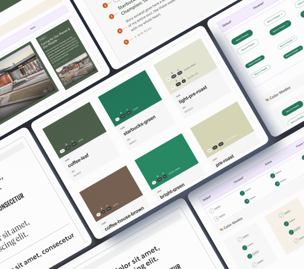
Scalable design system in Figma
I ensured design decisions could be reused across markets. This approach cut down publishing effort, gave editors confidence, and ensured the brand voice carried across evergreen stories and global markets.
System Architecture
32 reusable components delivered as part of a fully tokenized design system
Components support editorial storytelling, campaign content, and brand expression
Built for scalability across breakpoints and content types
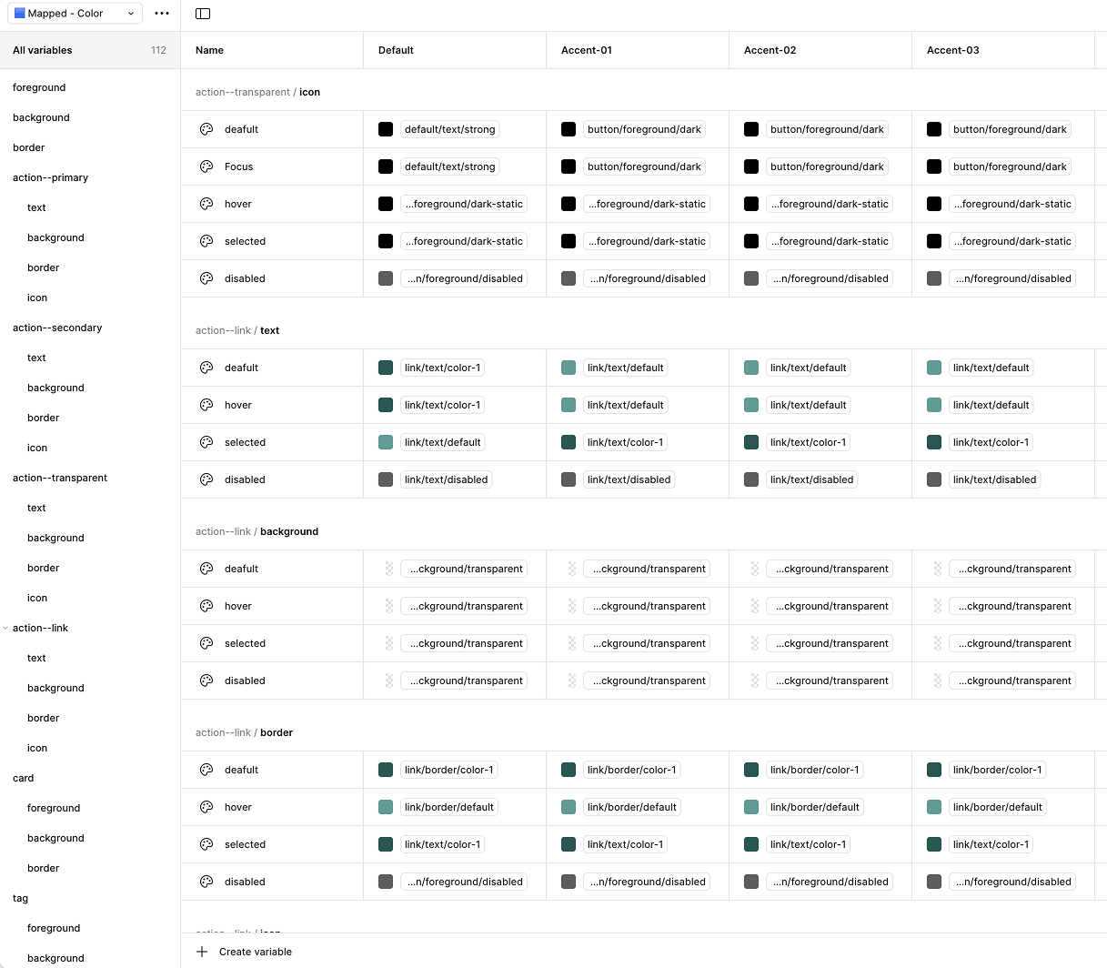
Design Tokens
The system was built on a foundation of design tokens that ensured consistency and enabled theming:
Color tokens: Brand palette, semantic colors, seasonal theme variations
Typography tokens: Scales, weights, and hierarchies optimized for editorial content
Spacing tokens: Consistent rhythm for layouts and component composition
Component tokens: Standardized properties for buttons, cards, modules, and layouts
Tokens were documented in Figma and translated to code, ensuring design and development stayed in sync.
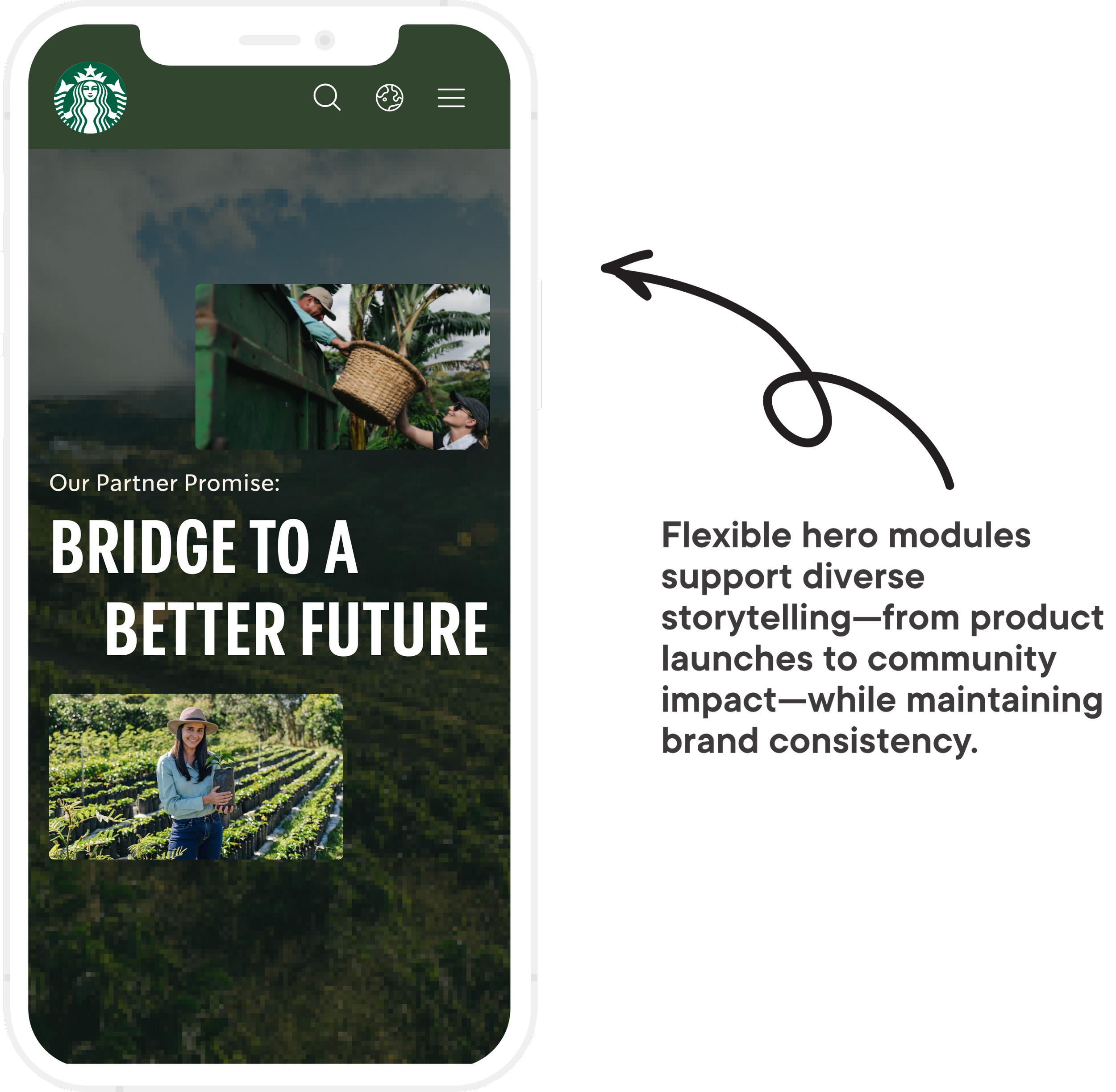
Seasonal Theming
I created a flexible theming system that allowed Starbucks to adapt visual expression for seasonal campaigns without additional design or development work:
4 seasonal color modes built into the system (Standard, Red Cup/Holiday, Earth Day, Pride)
Each theme includes color palettes, typography adjustments, and component variations
Themes can be activated globally or applied to specific content sections
Enabled visual flexibility for initiatives like Red Cup season while maintaining brand consistency
This theming approach meant Starbucks could respond to cultural moments and seasonal campaigns with speed and confidence, without custom development for each initiative.
Design Decision:
How do we enable seasonal theming without fragmenting the design system?
Starbucks wanted bold seasonal expression (Red Cup, Pride, Earth Day) but couldn't afford maintaining separate component libraries for each theme. We built a token-based theming system where color, typography, and spacing could shift globally while component structure remained consistent. This meant a single codebase could support 4+ seasonal modes without multiplying design or engineering debt, and new themes could be added in days, not months.
Seasonal Theming in Practice
The river layout combined the latest news with evergreen stats and an editorial image intro. Rounded edges, adaptable type scales, and themed tokens gave the component a dramatic seasonal voice while still aligning with the core system. This balance allowed Starbucks to keep content visually fresh without creating new one-off templates.
The theming system enabled rapid visual adaptation across:
Campaign launches (e.g., holiday promotions, product debuts)
Cultural initiatives (e.g., Pride, sustainability campaigns)
Market-specific storytelling while maintaining global brand consistency


Brand Expression
I brought the Starbucks voice into digital form with typographic rhythm, authentic photography, and expressive layouts. The system balanced clarity with emotion—ensuring stories felt human while maintaining brand consistency.

Editorial Clarity
I established consistent hierarchies, spacing, and components to make long-form content easier to read and navigate. By standardizing modules like quote blocks and stat callouts, we gave editors structure without sacrificing creativity.

Modularity and Seasonality
Creating a system that flexes for both evergreen storytelling and seasonal campaigns like holiday promotions required careful constraint management, foresight, and a cross-functional collaboration model.

Red Cup Campaign
The new system launched on about.starbucks.com with the Red Cup campaign as its first seasonal test.
“We relaunched the Starbucks company website today and I'm very proud of this effort. It was an effort that was driven by data, born out of qualitative and quantitative insights, with a look towards how we can modernize and update. It came out better than I could've imagined.”
Brad Nelson
Starbucks, Global Communications
LinkedIn

This project reinforced how editorial systems can serve not just content—but culture.
Designing for narrative flexibility while protecting brand clarity required constraint management, foresight, and a cross-functional collaboration model.
The most rewarding part? Shipping a system that dozens of teams now use to tell more meaningful, values-driven stories at scale.
Reflection
100%
System met full WCAG accessibility compliance in collaboration with Starbucks’ internal accessibility team.
32
Reusable components delivered as part of a fully tokenized design system, supporting editorial storytelling, campaign content, and brand expression.
4
Seasonal color themes built into the system—enabling visual flexibility for initiatives like Red Cup, Earth Day, and Pride without additional dev lift.