Designing a cross-platform design system for a fragmented ecosystem
Legrand’s native apps, dashboards, and installer tools were built on ten different programming environments with no shared foundation. I created a unified design system in Adobe XD, built in light and dark mode, that reduced UX design effort by 65% and brought consistency across every platform.

My Role
Lead Systems Designer
Scope
Design System Architecture, Component Library, Tokenization, Governance & Contribution Model, UX Foundations, Documentation
Overview
Legrand’s fragmented ecosystem made it difficult for the UX team to scale. Designers were recreating patterns across multiple products, leaving little time for testing and accessibility improvements. Engineers were spread thin across ten programming environments, which slowed delivery and made even small updates inconsistent and costly.
Designers and engineers lacked a centralized source of truth, creating rework across consumer apps, dashboards, kiosks, and installer tools.
Fragmentation introduced barriers to scaling new features and maintaining accessibility standards.
Inconsistent branding and UI patterns undermined both professional installers (B2B) and end consumers (B2C), weakening the overall customer experience.
Design debt accumulated quickly, preventing the UX team from focusing on research and validation.
User Interview
To align Legrand’s fragmented teams, I ran interviews, surveys, and workshops with engineering, UX, and product groups to uncover pain points and opportunities for unification.
Key Findings
Consistency valued, but hard to scale — Developers supported reusable components but faced cross-platform complexity (Xamarin, Swift, Kotlin, Angular, React).
Small teams, big workload — Most apps were maintained by teams of 1–5, making it difficult to balance new features with upkeep.
No single source of truth — Brand updates and guidelines were applied inconsistently, slowing delivery and creating accessibility gaps.
78% used reusable assets, but without governance or standards.

Survey results from 16 Legrand stakeholders revealed small teams with limited design resources, heavy reliance on external support, and inconsistent capabilities across groups—underscoring the need for a unified system.

Survey data showed teams were under constant pressure to build and maintain apps, relied heavily on reusable assets without shared standards, and worked across a fragmented mix of technologies.
Audit
I conducted a comprehensive audit of Legrand’s digital products, spanning consumer apps, installer tools, kiosks, and dashboards. The review exposed just how fragmented the ecosystem had become.
Key findings:
Varied device types — products were spread across residential, commercial, and installer contexts, each introducing its own patterns and requirements.
Inconsistent styles and patterns — navigation, buttons, forms, and content cards appeared in multiple variations, with no shared standards.
Design debt — redundant solutions emerged across apps, creating inefficiency and making it harder to evolve features.
Accessibility gaps — contrast, spacing, and input labeling were inconsistent across platforms.
Brand fragmentation — visual identity and interaction models differed noticeably between products, weakening the overall experience.
This audit provided the baseline for defining system foundations and identifying the most critical components to unify.

Audit of Legrand’s ecosystem revealed fragmented apps across brands and device types, with overlapping tools in lighting, power, audio/video, and network management.

Component inventory exposed wide variation in navigation, media, list, and card patterns across Legrand apps
Foundations
Key foundations included:
Color palettes — established light and dark themes with defined palettes for brand and product families.
Typography — set a type scale and hierarchy that carried across consumer, installer, and kiosk products.
Icons — standardized stroke weights, sizing grids, and usage rules, ensuring icons worked in both outline and filled versions.
Spacing and layout — defined consistent margins, padding, and alignment to bring rhythm across varied screen sizes.
Interaction states — documented consistent behaviors for hover, active, error, and disabled states.
By grounding the system in these foundations, we reduced ambiguity and gave teams a reliable starting point that scaled across ten different programming environments.
Documented Legrand’s color system across light and dark themes, including brand palettes, functional usage, and accessibility matrices mapping background and text combinations to WCAG compliance.
Established a standardized icon library of 300+ assets with line and filled variants, documented grid, stroke, and usage rules to ensure consistency across products.
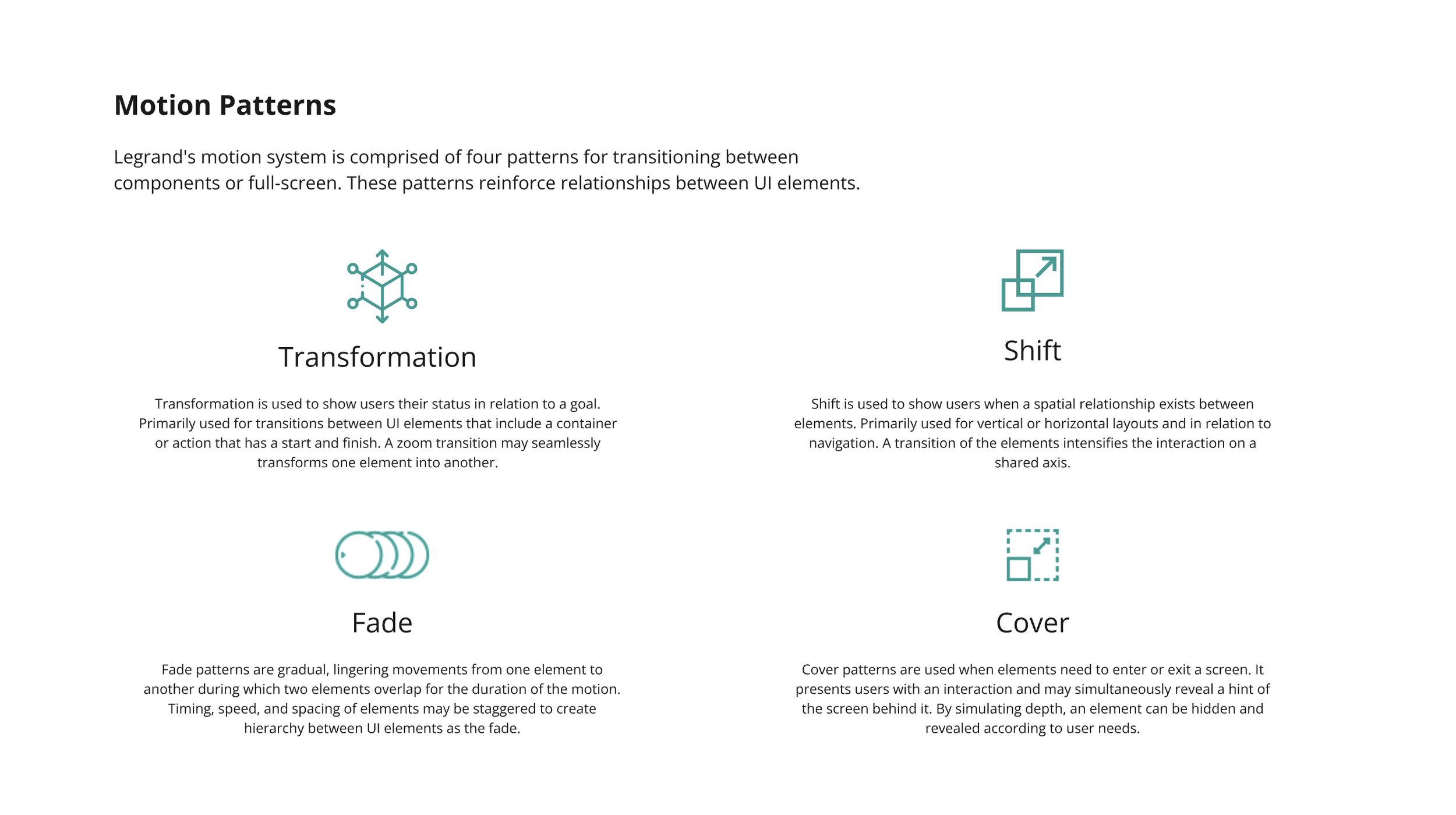
Motion
Motion played a critical role in creating a cohesive, intuitive experience across the product ecosystem. Because the system spans multiple interaction types—from screens transitioning to component-level micro-interactions, we needed a motion language that felt consistent, purposeful, and scalable. Our goal was to create motion that communicates, not decorates: guiding orientation, clarifying hierarchy, and reinforcing the brand’s personality through movement.
Key aspects included:
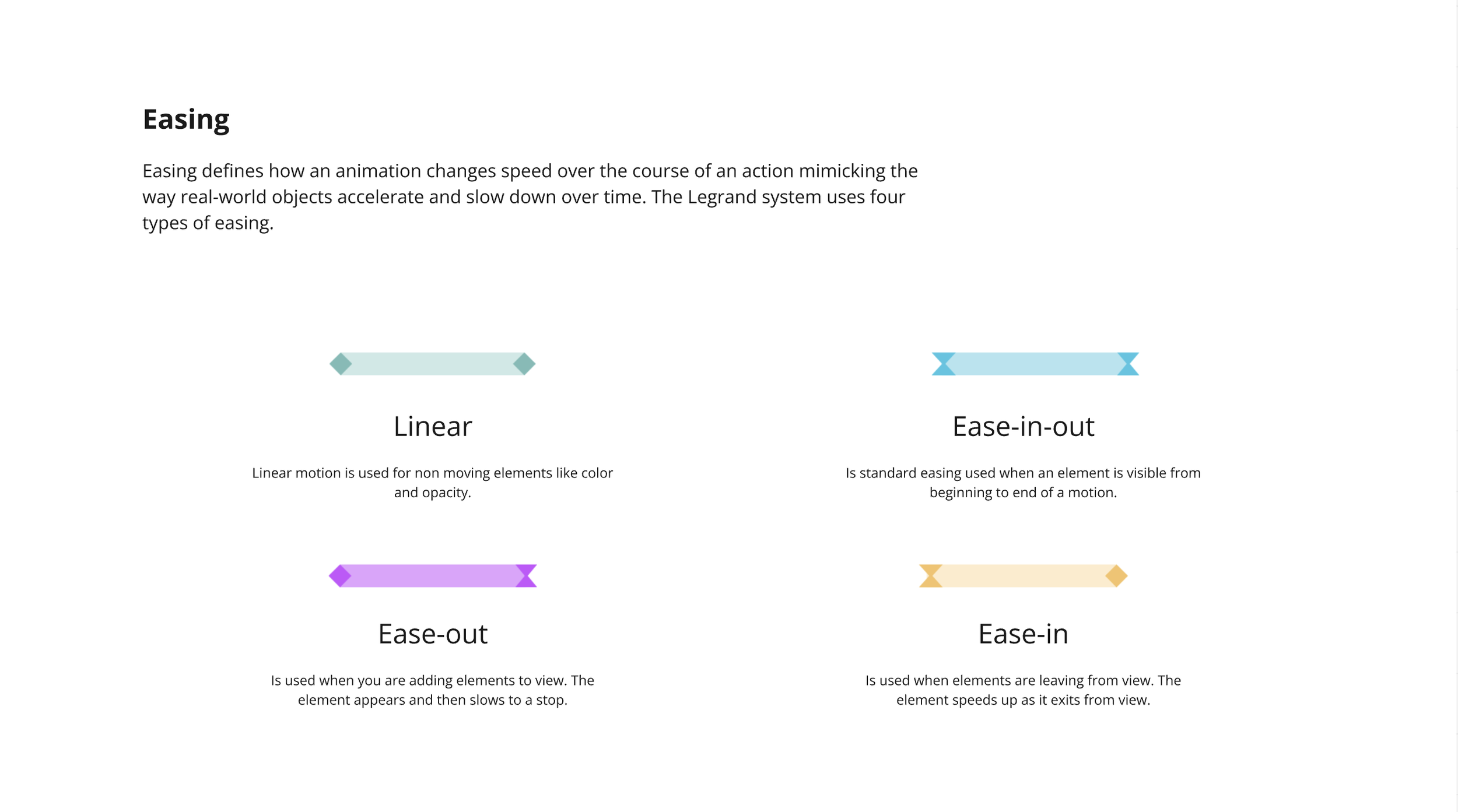
Easing system — defined a clear set of easing patterns (linear, ease-in, ease-out, ease-in-out) to create predictable, consistent motion across the product.
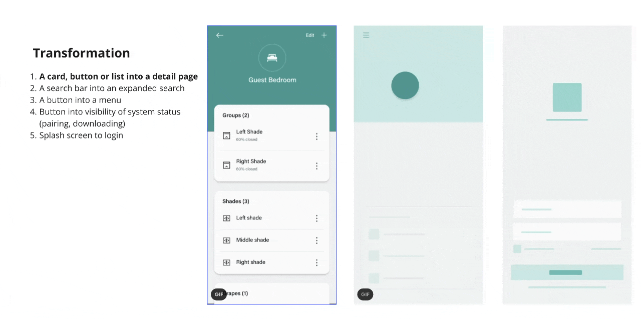
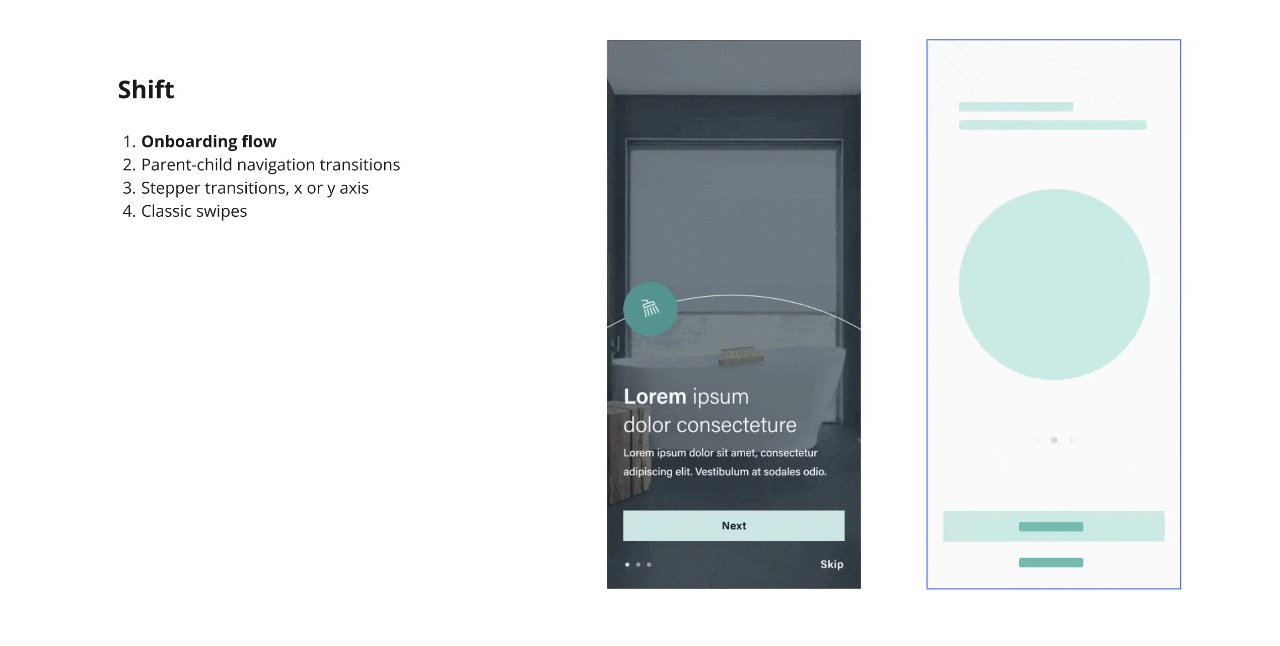
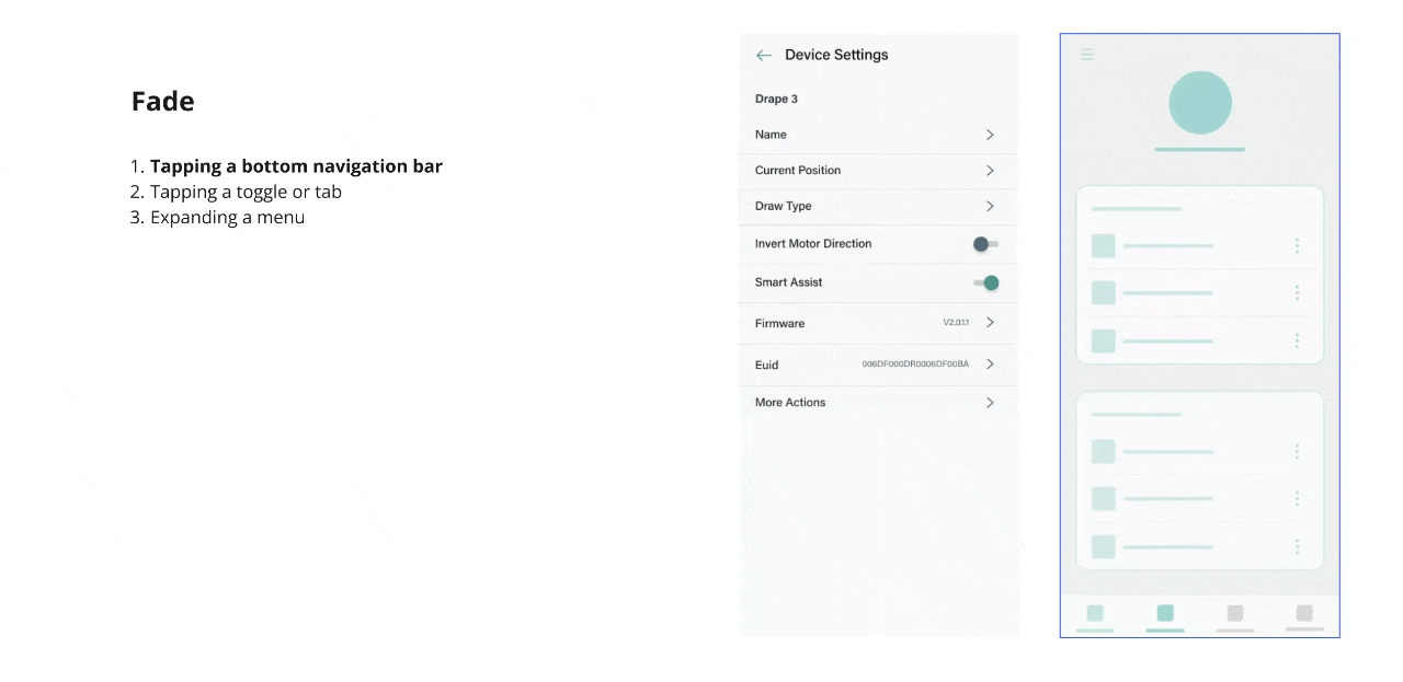
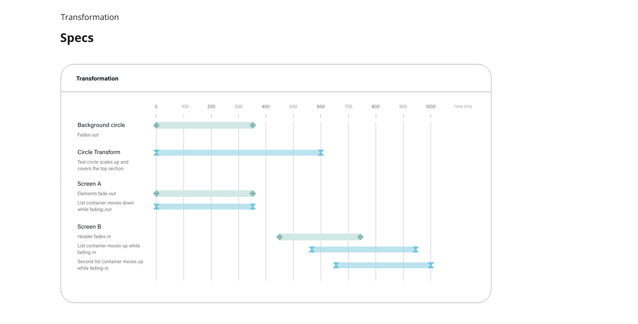
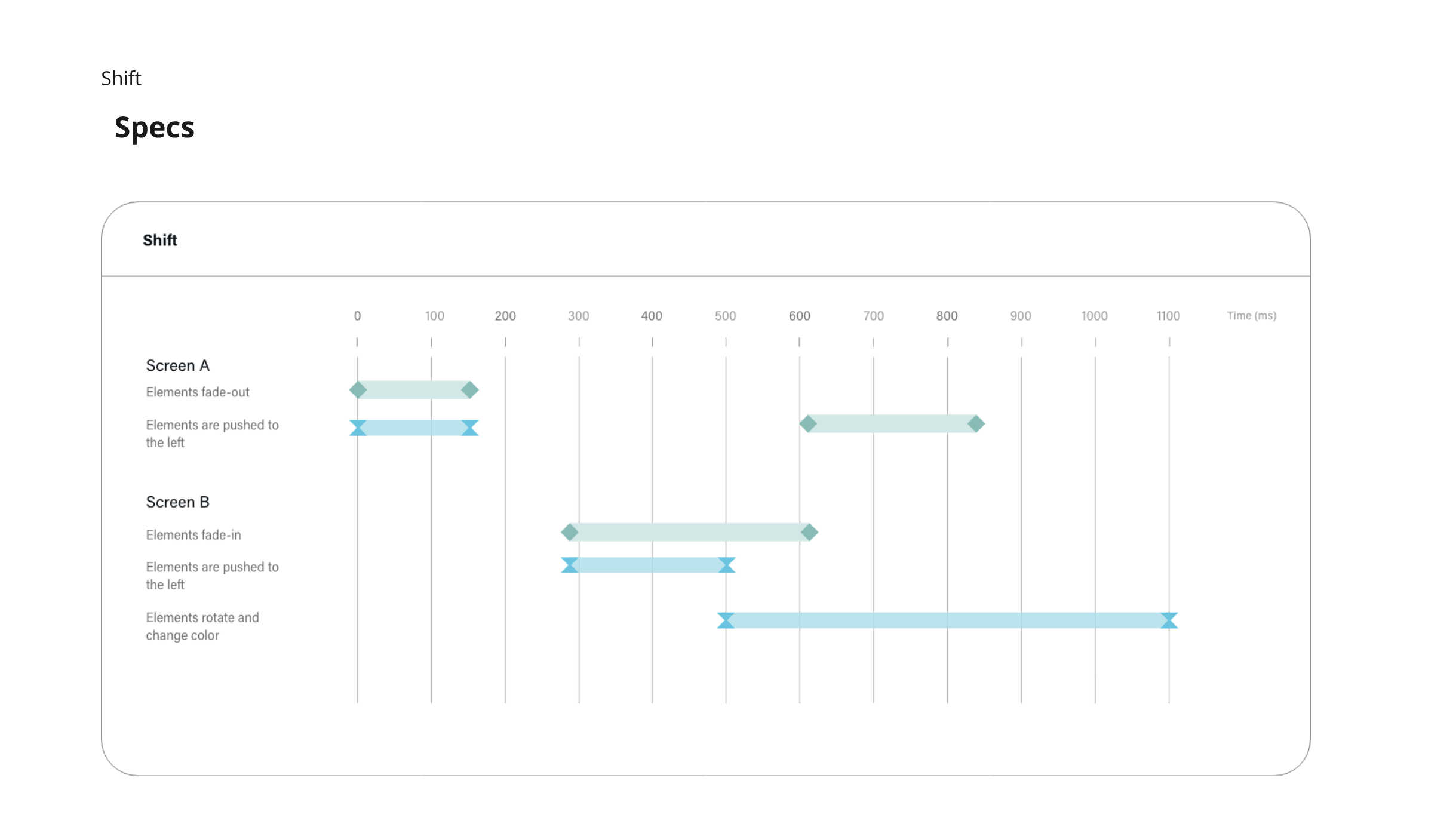
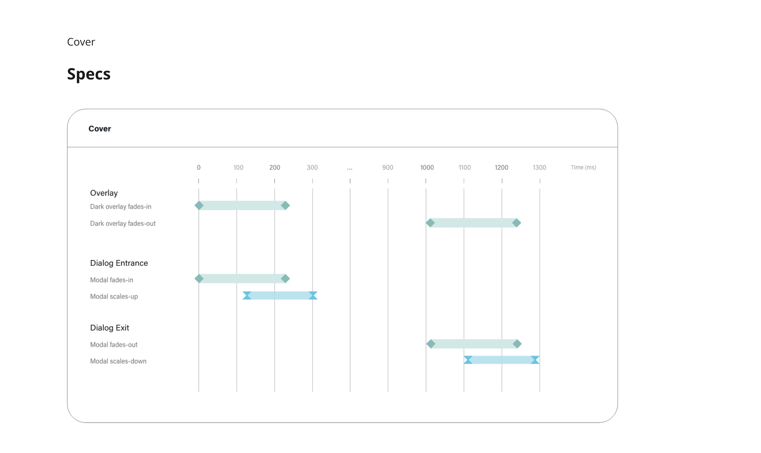
Motion vocabulary — named and framed four motion types (Transformation, Shift, Fade, Cover) to standardize when each pattern should be used.
Low-fidelity motion studies — created early timeline mocks to test pacing, sequencing, and rhythm before investing in animation.
Formal specifications — delivered detailed timing, staggering, and easing specs to ensure accurate engineering implementation.
High-fidelity prototypes — produced polished motion demos that illustrated real UI transitions and aligned cross-functional teams on expected behavior.
Components
Building on the foundations, I created a reusable component library in Adobe XD that scaled across consumer apps, dashboards, and installer tools. Every component was designed to work in both light and dark mode, reducing duplication and ensuring consistent behavior across platforms.
Key aspects included:
Cross-platform scalability — components adapted to mobile, web, and installer tool contexts while maintaining brand consistency.
Anatomy — each component was documented with clear anatomy guidelines, showing structure and usage across variations.
Accessibility — built-in support for contrast, spacing, and input labeling to align with compliance standards.
Interaction states — hover, active, error, and disabled states applied consistently across form elements, navigation, and utility UI.
Reusability — designed as flexible building blocks that reduced UX design effort and minimized rework across ten programming environments.
This library became the backbone of Legrand’s design system, enabling teams to design and build faster without sacrificing consistency or accessibility.
Pilot Approach
Before scaling the system across all products, we validated it through targeted pilots. These pilots gave us the opportunity to test the design system in both installer-facing dashboards and consumer-facing apps, ensuring components worked in real-world scenarios.
We started with:
Middle Atlantic and Raritan dashboards — installer tools used daily for device management and monitoring. These validated that the system could handle complex data-heavy UIs in both light and dark mode.
Consumer app screens — key onboarding and lighting control flows, where usability and accessibility were critical to adoption.
The pilots demonstrated component flexibility across device types, proved cross-platform usability, and surfaced feedback from real users and engineers. This reduced risk and built confidence ahead of a broader rollout.

Middle Atlantic dashboard comps showing light and dark mode views for monitoring and managing power devices, with clear status indicators, outlet controls, and real-time logs.


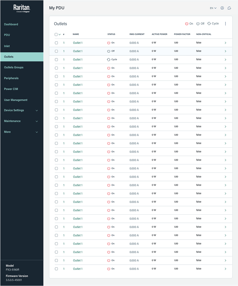
Raritan PDU dashboard and outlets view, providing real-time monitoring, historical trend analysis, and granular outlet control within a scalable interface.
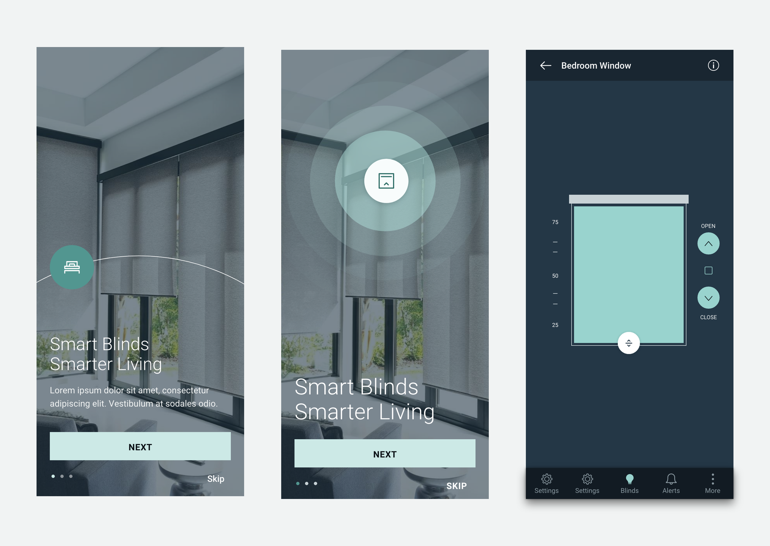
Onboarding and control screens for smart blinds, combining a guided setup experience with an intuitive interface for adjusting blinds in real time.
Designing for Legrand was less about building a single library and more about creating a system that could scale across very different product types — from consumer apps to installer dashboards. By addressing design debt and standardizing foundations, the system gave the UX team more time to focus on testing and validation, while giving engineers consistent patterns across ten programming environments.
The work proved that a design system can reduce overhead while still adapting to diverse platforms, device types, and user groups.
Reflection
10
Programming environments unified under one system
65%
Reduction in UX design effort
4
Major platforms supported: iOS, web, kiosks, and installer tablets