
Unifying 23 microsites into one scalable design system
I architected Publix's first enterprise component library, establishing the foundational system architecture, component API standards, and governance model that enabled 23 microsites to launch from a single source of truth—reducing engineering duplication, accelerating deployment cycles, and creating a scalable foundation for ongoing expansion.

The Challenge: A Fragmented Microsite Ecosystem
Publix was managing 23 independent microsites for campaigns and community groups, each designed and developed in isolation. This fragmentation created duplicated work, inconsistent experiences, and slow launches that couldn't keep pace with marketing needs.
Working with the design and engineering teams, we identified:
Fragmentation: 23 microsites with their own design, workflows, and technical debt, leading to uneven experiences across sites.
Inconsistency: No shared components or tokens, resulting in varied experiences that undermined brand trust.
Inefficiency: Template changes required 2-3x more engineering time without reusable foundations.
Scalability: New site launches were slowed by lack of shared standards and governance.
The business impact
Maintaining separate sites required two to three times more engineering effort, slowed time-to-market for campaigns, and risked inconsistent brand experiences that could erode customer trust.
Project Details
My Role: Lead Systems Designer
Team: UX Researcher, 4 Product Designers, Engineering Teams (Front end, Backend), Product Manager, Marketing Stakeholders
Scope: Design System Architecture, Component Library, Tokenization, Governance & Contribution Model, UX Foundations, Documentation
Timeline: 2.5 years (Discovery & audit: 3 months, Foundation & pilot sprints: 9 months, System rollout & adoption: 12 months, Ongoing maintenance & evolution: 6+ months)
Scale: 23 microsites unified, 40+ reusable components created, 60% reduction in design effort, 40% faster time-to-market
Audit
Rather than auditing only high-traffic pages, we chose to review every microsite to ensure unique requirements weren't overlooked—a slower start that paid off with smoother adoption later.
This comprehensive audit revealed:
More than a dozen redundant patterns that could be consolidated for significant time savings
Clear opportunities where consolidation would yield the most impact
Baseline business costs showing that maintaining separate sites required two to three times more engineering effort
The audit established both the problem scope and the business case for leadership investment.
Technical Collaboration & Adoption
Working closely with engineering, I translated design requirements into clear component specifications—defining states, variants, and behavior rationale that informed implementation. We established a "brownfield-to-greenfield" migration strategy: new sites launched on the system immediately, while existing sites adopted components incrementally during planned updates.
Overcoming Resistance: The biggest challenge wasn't technical—it was cultural. Teams worried about losing creative control or that "their site was too special" for a shared system. We addressed this by:
Involving resistant teams in template and component design to ensure their needs were represented
Building flexibility through tokens and variants rather than rigid, one-size-fits-all patterns
Documenting clear contribution processes so teams could propose new patterns
System Architecture & Engineering Collaboration
Before designing individual components, I worked with engineering to architect the system's technical foundation—establishing the token hierarchy, component API standards, and composition rules that would allow one library to serve 23 different microsites. This meant translating design requirements into technical specifications, validating feasibility within Publix's tech stack, and ensuring the system was maintainable long-term.
These architectural decisions happened in close collaboration with the front-end team, ensuring every design choice was technically sound and every component spec was buildable.
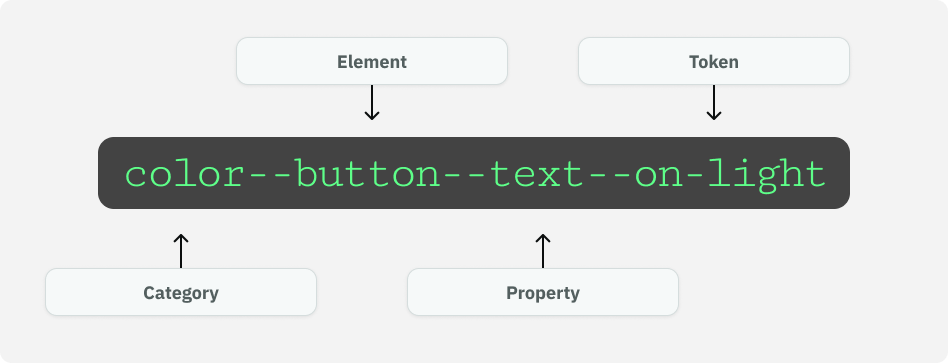
Color & theming.
Clear roles were defined for brand vs. neutral surfaces, accessible foreground/background pairs, and state tokens for hover/focus/active/disabled states, ensuring compliance with WCAG 2.2 AA accessibility.
Color system features:
Documented colors with accessibility compliance built in
Defined color primitives as raw baseline values for theming reference
Created semantic tokens themed by surface color, applied consistently across text, icons, borders, forms, and other UI elements for scalability
Defined color primitives
Created semantic tokens themed by surface color, applied consistently across text, icons, borders, forms, and other UI elements for scalability
To support accessibility and color documentationt, I built a small Figma plugin using cursor that automatically generated our accessible color cards—pulling in base colors, calculating contrast ratios, and outputting the standardized swatch components shown here.
Typography
The typography system provides a token-driven, responsive type ramp with clearly defined roles, predictable scale relationships, and guidance to ensure consistency across experiences, products, and brands.
It includes:
Primitive tokens for raw typographic attributes
Semantic (role) tokens for design-intent mapping
Responsive scale logic (desktop / tablet / mobile)
A modular type scale (1.333) to ensure predictable hierarchical steps across headings, body sizes, and breakpoints
Governance rules for usage, line length, and hierarchy
Documented typography and semantic token planning
Semantic tokens for font sizing across breakpoints to ensure responsivness
The spacing system provides a tokenized, scale-driven layout foundation that ensures predictable structure across components, pages, and screen sizes. Built on a 4-point base scale, the system defines consistent patterns for inset, stack, inline, and page layout, using semantic tokens to standardize spacing decisions across all teams and surfaces.
It includes:
Primitive spacing tokens on a 4-point scale
Semantic layout tokens mapped to common UI patterns (Inset, Stack, Inline, Page)
Breakpoint-aware grid rules for horizontal structure
Component-level spacing behaviors (internal padding, gap logic, outer margins)
Page-level layout scaffolding for sections, templates, and full-width zones
Spacing & layout
Spacing documentation
Semantic spacing tokens across breakpoints to ensure responsivness
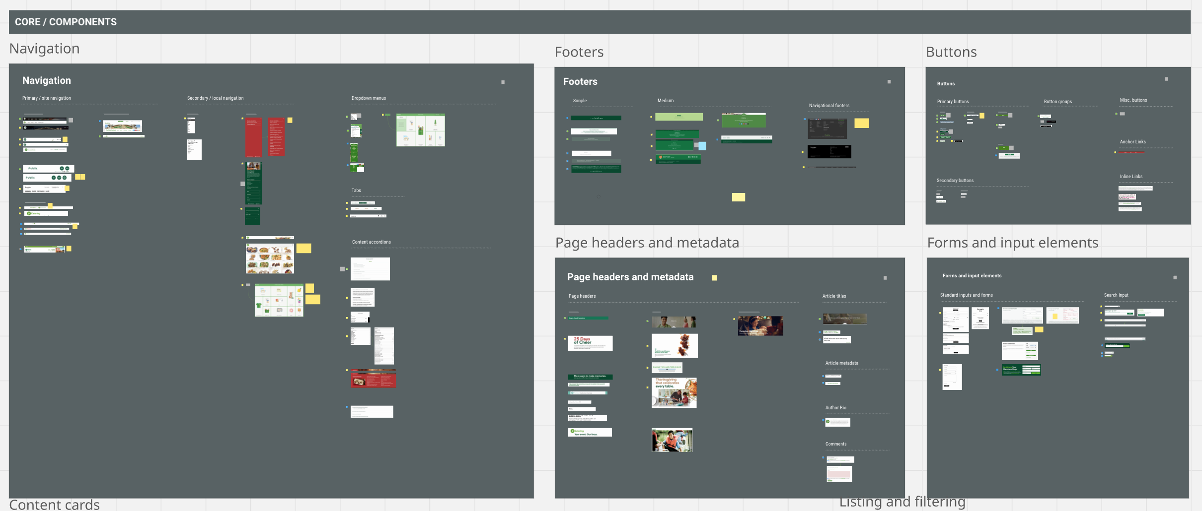
Component API
I architected a component API for Publix’s design system, defining the configuration options, states, slots, and content rules that every component in the library follows. This ensured 23 properties could build pages from a consistent, predictable system instead of one-off layouts.
I determined which aspects of a component could change and which could not.
Layout variants (e.g., Image Left, Image Right)
Alignment options
Density options (loose, tight)
Theme/emphasis options (on-light, on-color)
Optional elements (badges, CTAs, meta, supporting text)
API Design Standards
To ensure consistency, I established systematic rules: properties organized by category (State, Content, Layout), semantic naming that describes purpose rather than appearance, and predictable patterns across similar components (all form inputs use (label, helperText, required, errorText)
Variant properties a form component
Component documentation with character counts and storybook quick link
Instance Swap in a slot component in an accordion
Storybook Documentation
To ensure the design system was not only built but usable, I created documentation directly inside Storybook.
Authored Markdown-based docs from component anatomies, best practices, and usage guidelines, making Storybook a living catalog
Maintained Figma ⟷ Storybook parity, ensuring what designers saw in Figma matched the working coded components
This approach transformed Storybook into more than an engineering sandbox—it became the central source of truth for design, editorial, and development teams.


Storybook Connect in Figma, enabling components to be tested directly in Figma with live stories
Component Impact
The component library created consistency across microsites, reducing design and engineering duplication and allowing for faster rollout of editorial and campaign content.
Storybook became the single source of truth, giving both design and engineering confidence that components would behave as expected in production
It required extra upfront work to align every component spec with Storybook, slowing early progress but paying dividends later
Reduced misalignment, cut rework cycles, and accelerated launches while reinforcing accessibility compliance
Pilot Approach
Before scaling, we validated the system through targeted pilots. These allowed us to:
Test component flexibility on selected microsites
Prove cross-platform usability (web, mobile, internal tools)
Collect feedback from editors and engineers in real use cases
Pilots reduced risk and demonstrated component flexibility, building confidence for system-wide rollouts. The added coordination slowed scaling in the short term, but ensured smoother adoption. By validating with real teams, we reduced resistance, proved ROI, and prevented costly rework across future launches.

Workshopped goals, objectives, and user journeys with stakeholders before launching new sites.
System Governance & Long-term Stewardship
As the library architect, I established governance practices to ensure the system remained healthy and maintainable as it scaled across 23 microsites:
Contribution & Ownership Model: Defined clear roles for proposing, reviewing, and integrating new patterns—creating a predictable path for teams to contribute without fragmenting the system
Bi-weekly design system sessions: Facilitated ongoing collaboration with product teams to validate system usability, address gaps, and ensure the library served real product needs
Quarterly system audits: Reviewed component usage, identified consolidation opportunities, and deprecated unused patterns to prevent technical debt accumulation
Annual strategic workshops: Aligned stakeholders on system evolution priorities, exploring how the library needed to grow alongside emerging business requirements
This governance framework prevented the fragmentation and duplicate code that typically plague multi-product systems. By establishing these practices early, engineering maintained ONE codebase serving 23 digital properties, reducing maintenance overhead, accelerating launches, and ensuring long-term scalability.
Governance workshop to define roles and responsibilities between Publix and 10up designers.

Annual onsite roadmapping workshop, later translated into FigJam for ongoing documentation and alignment.
Designing for Publix wasn’t about producing a single library, it was about building a living system that could flex across microsites, serve very different audiences, and keep growing alongside marketing and design needs.
The work proved that a design system can be both efficient and adaptable, cutting overhead while supporting unique community-driven microsites.
Reflection
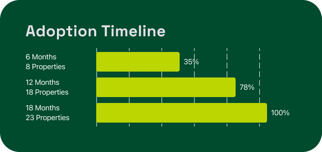
23 sites
Launched using the design system within one year
60%
Reduction in upfront design effort.
40%
Faster time-to-market for new microsites.